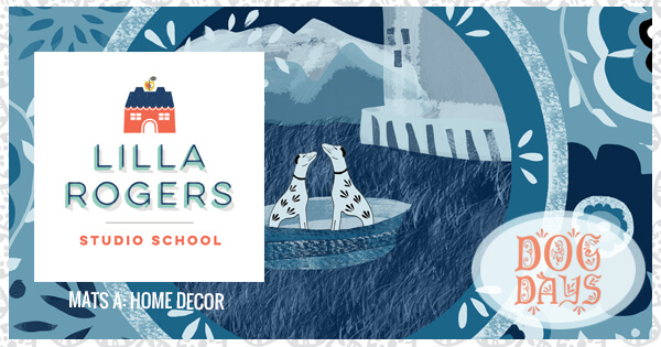
Our second assignment for Make Art That Sells (MATS) A is from the home decor industry. Lilla asked us to take a look at Staffordshire Figures. Of course I was drawn to the dogs and cats, and the beautiful blues. I do try to incorporate other colors, but I LOVE blue, and all of it’s variations. Monochromatic is quite a challenge and although I loved this process, I’m not sure I feel like this was adequate contrast in my blues in my main plate. The idea was to have at least two and up to 4 plates, and the inspiration was Staffordshire Figures.
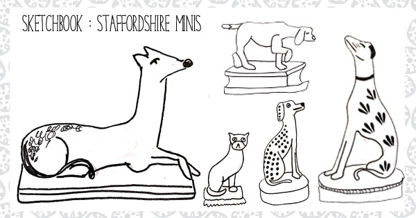
I love dogs, and so this is where I drew my inspiration from. I was struck by how delicate the figurines looked. Many had beautiful little patterns which inspired the coordinating patterns on the plates for the rest of the collection. They are cute and playful! Don’t you just love them?
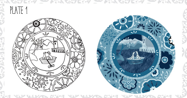
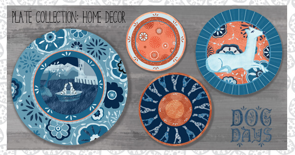
And cute and playful is where my first plate took me. A moonlit cruise for two puppy dogs in love. I scanned in my original drawing and then illustrated it in PhotoShop. I started using PhotoShop in college with it’s first version. I never imagined that I would be using it to illustrate 20+ years later.
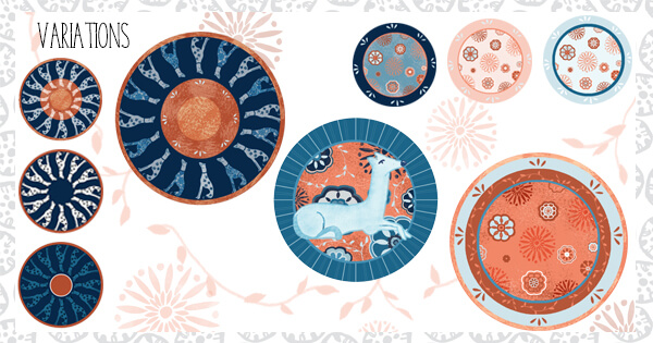
The next step was to create coordinating plates. I found the last plate on the right to be the biggest challenge. I wanted to settle on a coordinate that would tie the plates together. I tried monochromatic peach/orange, and monochromatic blue. In the end, both colors were the only way that I felt I could tie them together, and what started out a simple plate now incorporates many of the elements of the other plates. This was such a different process than creating Bolt Fabrics.
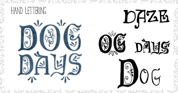
After I was satisfied with the collection as a whole, I tackled the Hand Lettering. I researched fonts and styles of the time, and came up with a name that I feel suits the pieces. Although, I have been drawing words since I was a kid, I have not spent a significant amount of time exploring hand lettering. It is by far one of the most interesting ways to combine graphic design and illustrating. It feels like a natural progression. I am working on it a lot these days and hopefully will continue to improve. “Dog Days” was created in ink, scanned in, reworked in PhotoShop and then cleaned up in Illustrator.
This is everything pulled together! Thank you for following me!

Sorry, comments are closed for this post.